 Blighters are a modern band, first formed in 2005, however are heavily influenc
 ed by the 1980's and the bands of this era, such as Japan. I want to create an album cover that reflects the 1980's, but also is relevent and appealing to a modern 21st century audience. The idea of using individual sections of an object to create the bigger picture, similar to how it's used in the image above, would be appropriate for a band like Blighters, as the polaroid images creates a sense of nostalgia because polaroids were one of the first instant cameras. The use of polaroid images also creates an artisitc, creative feel and suggest individualism which should be considered as the product should appeal to audiences and give them a sense of individuality and collectiveness.
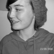
Images of the band
Rilo Kiley's album "under the blacklight" has the members of Rilo Kiley on the cover, this familarises the audience with the band members rather than creating an elusive image; also the outfits used suggests the genre of the music. Using a spotlight to highlight the band draws the audiences attention to the band, making them the main focus of the album cover. The title above the band divides the attention between the band and the title, as it is directly above the band and the space between the band and the title is shared equally.
"Black Kids" introduce the band using an image as well, but the audience can only see the tops of the band member's heads as opposed to the whole band.  This creates an interesting effect as it suggest mystery, however at the same time doesn't allow the audience to familairise themselves with the band members. The use of the bubble font suggests the pop genre, however it is given a quirky edge because it isn't brightly coloured and the font doesn't fit all the way across the cover.
I like the idea of using images of the band, and I would try and use the people that the audience see when watching our video in order to create consistency and a sense of familiarity. It could prove effective as Blighters influence Japan use band images on the front of their album cover so would not only link well to their influences but also the era in that has influenced them as well.
No comments:
Post a Comment