 Although this is a simple design, it impacts the audience because of the bold solid use of colour against a solid blackground, by using a bold red and cream against a black background makes the band's name stand out. Also, the use of perspective suggests to the audience that the female on the cover is shouting out "Franz Ferdinand" this is also strengthened by the use of strong block capital letters that are opposite to the colour they're against (cream "Franz" against a red background); by shouting out the name of the band, or at least appearing too, suggests that she is trying to capture the audiences attention. The use of dots to implicate shadows on the female create an more interesting image and also allow her to stand out against the black background because of the where there aren't any shadows her skin is white.
 There are aspects of this CD cover that could be interesting to experiment with when designing Blighters CD cover, for instance the dots would make a plain image interesting because it looks as though the image has been printed, similar to images seen in a comic strip. The link to comic strips would also echo the 1980's, as comics were popular around this era. Using perspective also gives the image a twist because on this cover it is as though the female is speaking to the audience.
 Similarily with "Franz Ferdinand", "Tears for Fears" album cover is basic, however the colour scheme is blander compared with the bold colours used above. However, "Tears for Fears" album cover is perfect as the image and blank empty space used reflects the title of the album, because people often feel empty and blank when they're hurting. The audience are attracted to the image because they want to help the "hurting" child, and can feel sympathy towards him. Although, pastel colours are used the child still stands out against the off-white background because there is a light illuminating him, from behind him. He also is dressed in dark colours that contrast with the off-white background. Despite on Franz Ferdinand's album cover they have used a bold strong font, "Tears for Fears" opted for a minimalistic font that is simply placed in the top right hand corner. However, "Tears for Fears" title is strategically placed directly above the image of the boy; this could work either way, the audience look from the title down to the image of the boy or from the image of the boy to the title, either way the audience will be informed who's album this is. The strong black colour used contrasts with the off-white background drawing attention to it, because apart from the boy it is the only difference in colour.
 Although the CD cover is powerful, the blankness of the image isn't appropriate to the genre of "Blighters" who, compared with "Tears for Fears" are more flippant. The contrasting of colours is something that could be experimented with as it draws consumers attention to the cover, however I would probably experiment with bold strong colours as used by "Franz Ferdinand." The title is attention-catching because the colour is the inverse of the white background and the font is simplistic, which would work well with my idea for a CD cover, because of the busyness of my cover (multiple polaroids, one image); also by using a simplistic font on my front cover, it would be attention-catching as it wouldn't blend in with the polaroid image because the font would be clean cut.
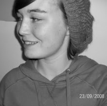
Jack Penate's album 'Everything is new' uses a black and white scheme which suggests a traditional tone, because the black and white palette is reminiscent of old photo's. The font is also traditional and ties in well the nostaligic tone that the album is implying. The sense of nostalgia that 'Everything is new' is suggesting is a theme/tone that I have attempted to interweave throughout my music video and will imply through my print production. I chose to have the artist on the front cover of my CD cover as it promotes the artist and familiarises the audience with the artist, although my image isn't as obvious as Jack Penate's image, which perhaps makes it harder for the audience to relate to my artist but it creates a sense of mystery which lacks in this album cover because you are able to not only see the artists face, but also the style of clothing that he's wearing. Due to the fact that there isn't obvious connotations to the indie/alternative genre on 'Everything is new' the style of clothing is included to implicate the genre; for my design I decided to use polaroids which are related to the indie/alternative audience (I found this out from research on social network sites by seeing the types of photo's that consumers associated with this genre use).
 uses a black and white scheme which suggests a traditional tone, because the black and white palette is reminiscent of old photo's. The font is also traditional and ties in well the nostaligic tone that the album is implying. The sense of nostalgia that 'Everything is new' is suggesting is a theme/tone that I have attempted to interweave throughout my music video and will imply through my print production. I chose to have the artist on the front cover of my CD cover as it promotes the artist and familiarises the audience with the artist, although my image isn't as obvious as Jack Penate's image, which perhaps makes it harder for the audience to relate to my artist but it creates a sense of mystery which lacks in this album cover because you are able to not only see the artists face, but also the style of clothing that he's wearing. Due to the fact that there isn't obvious connotations to the indie/alternative genre on 'Everything is new' the style of clothing is included to implicate the genre; for my design I decided to use polaroids which are related to the indie/alternative audience (I found this out from research on social network sites by seeing the types of photo's that consumers associated with this genre use).
'Silent Alarm' has been created in a similar way to Tears for Fears album cover; the lack of colour, the simplistic font, the dramatic image - although dramatic in different ways. The blur effect used on the tree line suggest reverbs from an alarm which has direct links to the name 'Silent Alarm' - all the audience can see is the effect of the alarm, they can't hear the sound. Similarly with the album cover idea I have decided on, my images will have direct ties to the name of the song 'The Exam'. Direct connotations assist the audience into imagining what the album is like and what the songs are about; this helps the consumer relate to the album and music better because they understand it. The blank white background makes the blurring stand out more on the black tree line because they contrast the white so obviously. The use of image connotes a sense of deathly silence, which again would link well to the name of the album; the vast open space and perspective allows the audience to imagine that the emptiness is neverending which in turn highlights the sense of loneliness and silent alarm as there is no one around to hear cries of help and therefore an individual's alarm would essentially be silent. The block font suggests cold hard reality and ties in well with the emptiness of the CD cover because it is simple and the steel grey colour complements the white and black palette; steel grey block lettering could symbolise industrialisation and the effect it's having on the modern world or on the human race, because the blank space could be the devastation it can potentially leave behind or the emptiness and loneliness that humanity experiences; this allows the audience members to engage with the music on a different level. Although the band themselves aren't shown on the album cover, the audience can possibly still relate to them on an emotional level because the individual consumer can assume that the performers felt a sense of this emptiness/loneliness when creating the music and instead of allowing the audience to relate to them on a physical level by having images of themselves they decided to let the consumer in on an emotional level, perhaps to create a deeper understanding.

Bloc Party also have a remixed version of 'Silent Alarm'; the album cover is the same, apart from it is in negative. Negative is an inverse of colour. The inverted colours could suggest an inverse emotions, changed emotions - different from the lonely, blank and empty feelings portrayed from the orginal 'Silent Alarm' album. The dark black background suggests a different time of the day compared with the original, whereas the brightness of the orginal suggests daytime, this suggests night; anything can happen in the dark (what you see isn't necessarily what you get) and Bloc Party are saying that anything could happen with this album, music connotes different things when remixed. Compared with the tone of industrialistation/factories implied in the font before, against the black background the font looks bright glowing, similar to city lights. As does the tree line, rather than trees as you see them naturally in the countryside, these trees seem as though they're lining a road or avenue, somewhere urban/suburban. The difference between these two 'Silent Alarm' albums suggest that there are two sides to every person, there are two different emotions you can have; sadness = the inverse is happiness, hatred = the inverse is love, anger = the inverse is calm; the audience are able to relate to the music with different emotions, because there are two different version of the same album; original and remixed.
No comments:
Post a Comment